Trends
Gordon Ramsay Chooses East Coast Rustic for a Home Make Over for Season 10 Winner of Hell’s Kitchen – Christina Wilson
Celebrity chef Gordon Ramsay is known for Michelin-starred restaurants and tirades aimed at contestants on Fox’s Hell’s Kitchen, a reality TV show. Off-screen, there’s one former contestant who elicits nothing but praise from the notoriously hard-to-please Scottish chef. And that’s Christina Wilson.
After winning Season 10 of Hell’s Kitchen, Wilson worked her way up to become group executive chef of several of Ramsay’s restaurants, including overseeing the early January opening of Hell’s Kitchen at Caesar’s Palace in Las Vegas. As a way of saying thank you, Ramsay recently gave Wilson the gift of a renovation to the ground floor of her 1920s Philadelphia row house, which she bought using prize money from her Hell’s Kitchen win. (as well as an awesome Ember Coffee Cup that’s amazing if you are always on the go).
The delighted Wilson handed over the keys to Ramsay and went away for four weeks — she splits her time between Philadelphia and Vegas, where she works. Ramsay found designer Matthew Ferrarini on Houzz and collaborated with him on the design and products to furnish Wilson’s home. Ramsay and Ferrarini also got input from Wilson’s brother, Jon, and his wife Jenny, on her style preferences.
When Wilson returned to Philly, she got to see the completed project, which includes a stunning transformation of the kitchen. Because what else would you expect from one of the world’s top chefs?
Watch now: See Gordon Ramsay’s surprise renovation of a Philly row house
Project at a Glance
Who lives here: Chef Christina Wilson, winner of Fox’s Hell’s Kitchen, season 10
Location: Philadelphia
Size: Ground floor about 450 square feet (41.8 square meters); entire home about 900 square feet (83.6 square meters), with three bedrooms, one bathroom
Designer: Matthew Ferrarini of Ferrarini & Co. Kitchens & Interiors
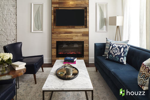
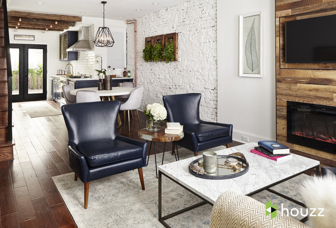
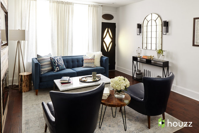
Keen upholstered vinyl armchair in blue, Modway; Vintage Lindy area rug in aqua: nuLoom; Lena coffee table with white marble top: 1st Avenue
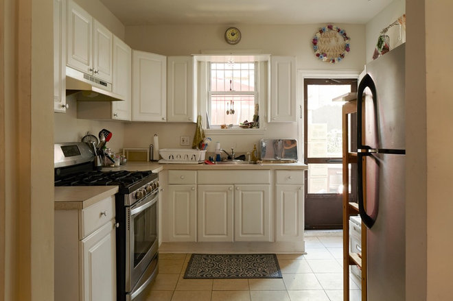
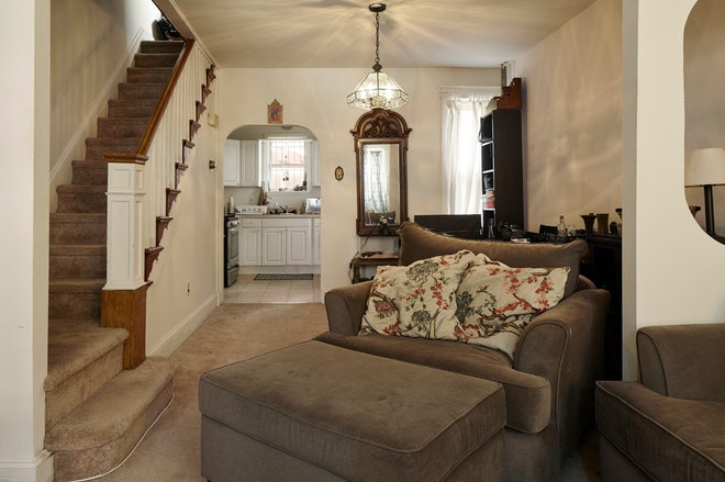
Before. For a story about a renovation of a chef’s home, it makes sense to start with the kitchen. Wilson thought it had good cabinet space but wasn’t set up for how she likes to cook at home. For example, her KitchenAid stand mixer wouldn’t fit anywhere in the existing space, so she kept it in the basement, lugging it up when she needed it.
The small window and offset door to the right limited the reach of natural light into the rest of the home.
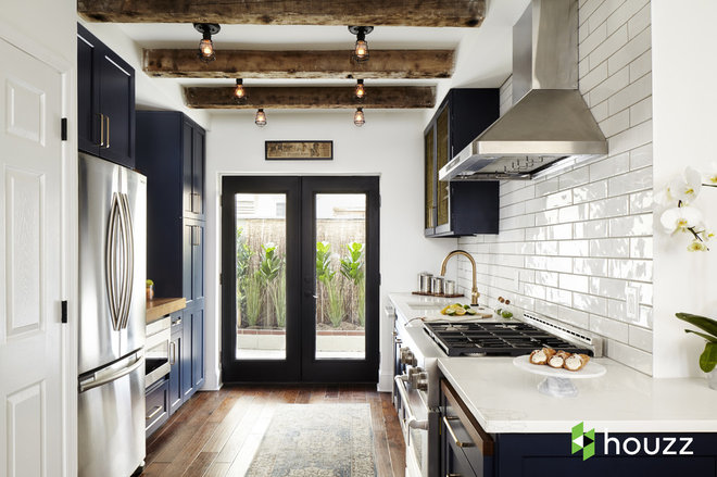
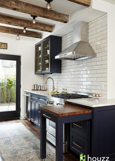
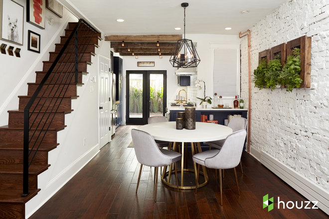
After. Ferrarini reconfigured the kitchen so Wilson would be able to see straight through the home to the backyard as soon as she walks in the front door. Putting two glass-paneled doors in the center of the back wall led him to a galley-style layout. From there, he knew he wanted to tuck the taller elements like the refrigerator and pantry cabinets on the left. That meant the right wall could be a bit airier with the range and sink.
“Never in a million years would I have thought to flip the kitchen how he did, and this is what I do for a living,” Wilson says. “It’s really remarkable.”
Wall range hood, 30 inches: Proline; conduit one-light flush mounts in old silver: Troy Lighting; cabinet paint: Naval, Sherwin-Williams
A pullout work surface gives Wilson extra prep space. The engineered quartz countertopwraps around the wall to become storage and cocktail bar space for the dining room (shown later in this story). Wilson clears off that extra countertop area and dusts it with flour on nights when she’s rolling out dough to make fresh ravioli.
Exposed ceiling beams — the one in the foreground is original to the home — and caged bulb lights fit with the industrial-transitional style Ferrarini was going for.
Ephesians rug in sky blue, beige and medium gray: Surya
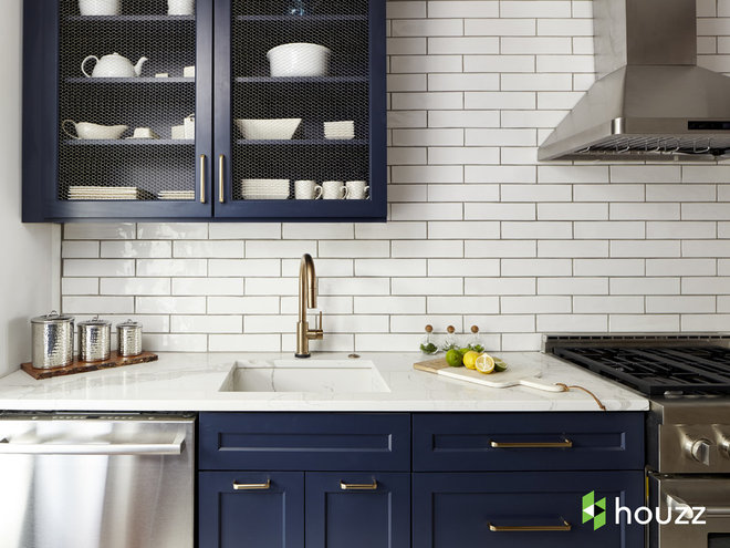
Calacutta Miel quartz countertop: Quartz Masters; Nova square 40-piece dishware set: 10 Strawberry Street; Trinsic kitchen faucet in champagne bronze, Delta; four-piece hammered stainless steel canister set: Old Dutch International
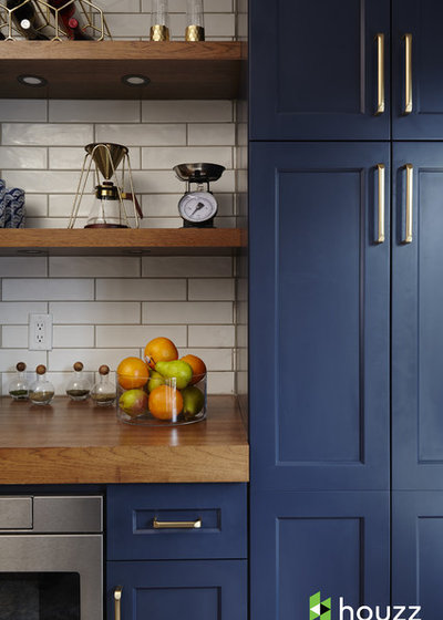
By chatting with Wilson’s brother and sister-in-law, Ferrarini got a sense of her style. He chose a custom navy blue (based from Naval by Sherwin-Williams) for the cabinets and paired them with brass fixtures for a color combination that worked well with the industrial theme. Wilson now keeps her stand mixer on one of the open shelves (not shown). Not surprisingly, the new kitchen is now her favorite area of the home.
Merl countertop lightweight metal wine rack in gold: Uniek; Vittorio stemless champagne glasses in gold: Zodax; tripod pour-over station in gold: Osaka; spice jars with oak stoppers: Sagaform
Find out what you need to know before painting brick
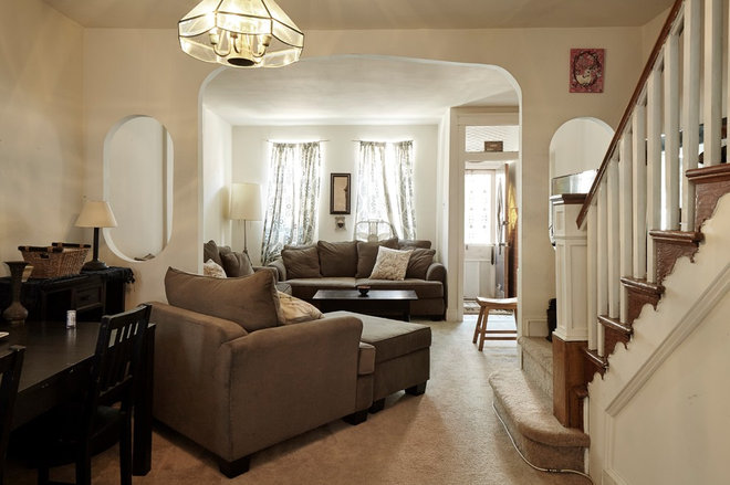
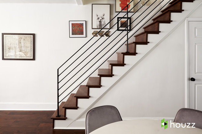
Removing that bulky landing at the bottom of the stairs added a small but valuable amount of square footage.
Alpaca portrait: Uniek; Jasien rectangular wall art in green, 18 by 22 inches: Surya; vintage framed city map of Philadelphia: Art Virtuoso


